


You spend hours perfecting your gameplay, practicing your commentary, and setting up the perfect streaming schedule, but viewers still leave after just a few minutes.
Here’s the brutal truth that most streamers refuse to accept: your graphics are probably driving people away before they even hear your amazing personality or witness your gaming skills. There’s one specific mistake that shows up on almost every struggling stream, and it’s so common that viewers have learned to spot it instantly.
The mistake is using mismatched graphics that look like they came from five different streamers. You know what I’m talking about. Your overlay has a futuristic blue theme, your webcam border is medieval fantasy style, your donation alerts are cartoon-like, and your social media graphics look completely corporate. When viewers see this visual chaos, their brain immediately thinks “amateur” and they click away.
Think about your favorite streamers for a moment. Notice how everything on their stream feels like it belongs together? Their overlay, alerts, panels, and even their offline screen all share the same colors, fonts, and overall vibe. This isn’t an accident. It’s called visual consistency, and it’s the difference between looking like a hobbyist and looking like someone worth following.
Your viewers make a judgment about your stream quality within the first three seconds of arriving. Before they hear your voice or see your gameplay, they’re scanning your visual presentation. If your graphics look thrown together randomly, they assume everything else about your stream will be equally unprofessional.
The solution is simpler than you might think. Pick one visual style and stick with it everywhere. If you choose a cyberpunk theme for your overlay, make sure your alerts, panels, and social media graphics all match that same energy. Use the same color palette across everything. Keep your fonts consistent. Make sure the art style flows together naturally.
Professional streamers understand that their graphics work as a team. Every visual element supports the others to create one cohesive brand experience. When someone visits their stream, sees their Twitter, or watches their YouTube videos, everything feels connected and intentional.
Many streamers try to fix this by buying cheap graphics from different designers or using free templates that don’t match. This actually makes the problem worse because now you have better quality graphics that still don’t work together. It’s like wearing an expensive suit jacket with gym shorts and flip flops.
The investment in coordinated graphics pays for itself quickly. Viewers stay longer, subscribe more often, and recommend streams that look professional. They trust streamers who clearly care about their presentation because it shows they’ll also care about delivering great content.
Your gameplay skills matter, your personality matters, but your visual presentation is what gives viewers permission to stick around long enough to discover those qualities. Stop letting mismatched graphics sabotage your streaming success before it even begins.

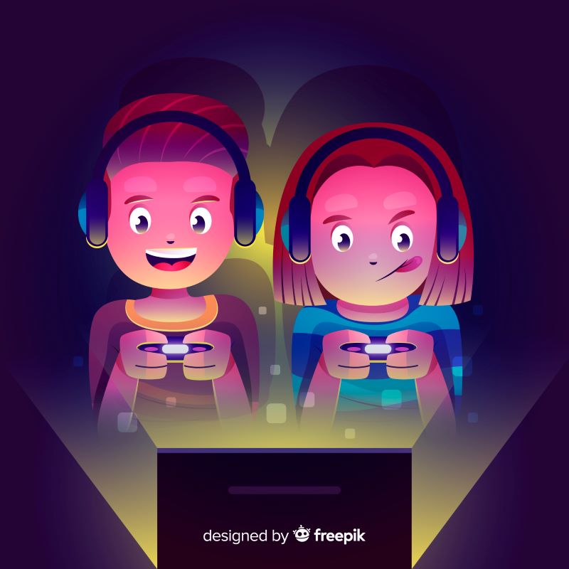
Designs that make streamers, creators, and brands unforgettable.
